Componentes generales
Vista previa
Descripción
A preview is usually shown for functions that require extensive processing. It is usually located in the upper right corner of the dialog as shown in the following example:
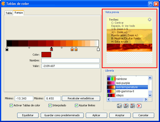
Component 'Preview'
The preview gives only an indication of how the final output will look like. Since only a minimum amount of data is used to generate the preview, the final result may be different.
The following options are available for preview windows:
- Move the image with the left mouse button.
- Center the image in the preview by pressing the C key.
- Zoom out to see the whole image with the space bar or 0
- Predefined zooms with keys 1 to 5. 1 gives a 1/1 zoom.
- Zoom with the mouse wheel or arrow keys + and -.
- Show a grid on the background to view images with transparency by pressing the B key.
- Access the help function by pressing the H key or clicking on the question mark in the upper right corner of the preview window.
The access to these preview functions through the shortcut keys only works when the focus is on the preview window, after clicking on it with the mouse.
For different types of functionality, the preview may appear with a different default zoom level. For example, the preview of colour tables is shown as completely zoomed out so that the effects on the whole image can be previewed.
Selector de resultados
Descripción
The output selection control is used to create new layers.
In this example the output selection control is shown in the lower right corner of the dialog (1):
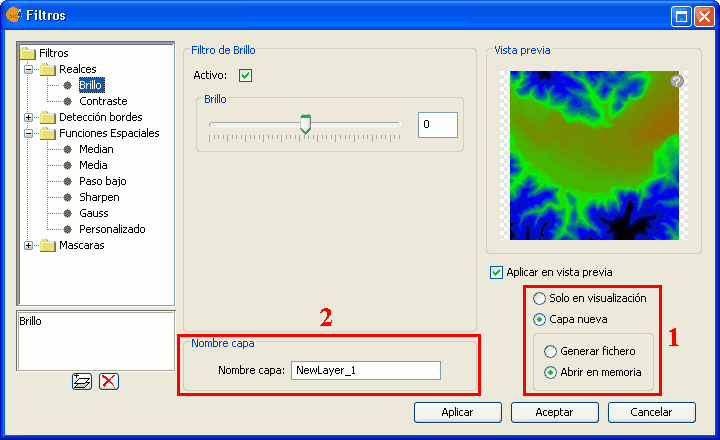
Output file selection
The selector consists of two components:
- For the output image, you can choose whether to apply the filters over the image in the current view (only for display) or save the output as a new layer.
- The option "Only on visualization" does not change the original layer, but will apply the list of filters when drawing and re-drawing the view. This option is faster when the image is very large (as the filters are only applied to the current view, not to the whole image), but it slows down the drawing and re-drawing of the view.
- The option "New Layer" will apply all the filters to the image and save the output to a new layer. This is faster when the image size is medium or small and the applied changes are considerable. The generation of the new layer will take some time, but then the displaying is as fast as it would be without the filters.
Both options have advantages and disadvantages, and it is up to the user to decide which option to choose.
- When selecting the option "New Layer", a second option control is enabled in which you can choose whether to save the layer to disk (Create file) with a file name specified in the text box (2), or to create a temporary gvSIG layer (Open in memory).
The new layer will be added to the view, and the TOC will show the layer name as specified in the text box.
** Note: The temporary working space of gvSIG is cleaned automatically, so any temporary layers will be deleted when exiting the application.
Control de tablas
Descripción
The table control component is used to represent data in tabular form and allows you to edit the data.
The possibilities are:
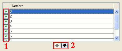
Table control components (1 and 2)
- Selection of rows in the table.
- Reordering the rows. Click on the arrow buttons to move a selected row up or down.
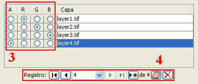
Table control components (3 and 4)
Choose a unique property for every row. In the example above, a band is allocated for each layer.
Typical table controls, as shown in the example at the bottom of the table. From left to right:
- Select the first row.
- Select the previous row.
- Drop down to select a particular row.
- Select the next row.
- Select the last row.
- Create a new row.
- Delete the selected row.
- Delete all rows from the table.
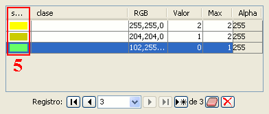
Table control components (5)
- In the table control, besides being able to edit anything if editing is enabled, you can also change the color by clicking on it.
Barra de progreso
Descripción
When running processes that may take a considerable amount of time, a progress bar is shown.
The progress bar indicates that a process is running in the background and informs the user on the status of the process at any given moment and on how much time has elapsed since the process started.
In the image below, you can see a screenshot of the progress bar during a running process.
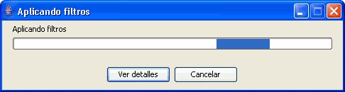
Progress bar component
The progress bar consists of several parts. The title indicates which process is running. Below the title, the current task that is being processed is indicated as well as the percentage of the process that has been completed.
The progress bar contains two buttons. To see more details, you can click the left button, after which the dialog is enlarged to display additional information as in the screenshot below.
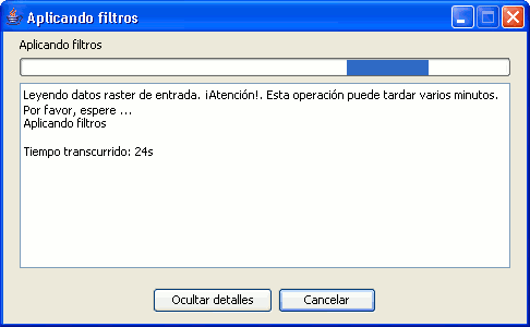
Progress bar with details
The additional information includes a list of tasks that have been performed and an indication of how much time has elapsed since the process was started.
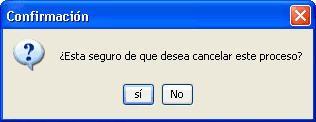
Confirmation message: are you sure you want to cancel this process?
If you want to cancel a process, you can click on the "Cancel" button on the right. A message will appear to prompt for confirmation. Clicking on the "Cancel" button does not always guarantee that the process is stopped immediately. Depending on the process, certain tasks might be needed to reverse the process and return to the previous state.
Estadísticas finales de generación de capa
Descripción
When processes that display a progress bar have ended, a statistics window with details of the process is usually shown.
Examples of such processes that launch statistics windows are Filters, Crop, Save As, etc.
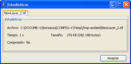
Statistics component
The statistics window shows the following information:
- File: Complete file path where the image has been stored.
- Time: The time that it took to complete the process.
- Size: File size on disk.
- Compression: Whether or not the image file has been compressed.
If you have generated more than one layer in the same process (as is the case when cropping images with multiple bands) the statistics window will display the information of each layer in a different tab.
The window can be closed by pressing the OK button.
Barra de herramientas desplegable
Descripción
With the increase of image processing functions in the menu of gvSIG, the toolbar had to incorporate these Raster functions by grouping them as pull-down buttons.
As can be seen in the image below, when a view is selected, a control will appear at the right side of the toolbar.
Drop-down buttons for raster functions in the toolbar
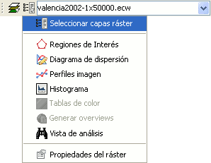
The control has two drop-down buttons and a search combobox with the name of the current layer.
The buttons work as follows (see image below):
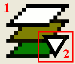
Raster drop-down button, with two zones (1 and 2)
- Clicking in this area will change the visible order of the button.
- Clicking the area with the pointing down arrow shows the menu of options.
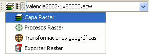
Groups of raster functions
With the first drop down button you can access a set of grouped functions. For each group of functions, the individual functions within that group will be shown in the second button. Therefore, the functions that are available in the second button depend on the group of functions that is chosen with the first button.
Individual raster functions shown in the second drop-down button
In the image above, the individual functions from the second drop-down are shown while in the first drop-down button the function group "Raster layer" is selected.
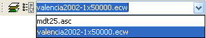
Combobox with the name of the current raster layer
The search combobox is used to select one of the layers in the TOC. When clicking on the arrow on the right, all the possible layers are shown.
Search Combo to select a raster layer
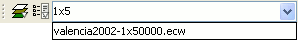
You can write text in the combobox to filter the list of images (i.e. write "1x5" to show only layers that have these characters in their name).
